James Turrell
James Turrell
influenced by the notion of pure feeling in pictorial art
constructing light and painting with light
building on the sensorial experience of space, color, and perception.
Turrell produced some of his first light sculptures, using gases to create flat flames that burned in even colors.

James Turrell, From Aten Reign, 2016,
Ukiyo-e Japanese style woodcut with relief printing, 26" × 18-1/2" (66 cm × 47 cm), Edition of 30 + 6 APs © James Turrell
work with high-intensity projectors as a light source, producing the first of his Projection Pieces, Afrum-Proto.
These studies of perceptual anomalies further ignited his interest in the celestial realm, and he began to incorporate aviation into his practice by creating sky drawings with the artist Sam Francis.
Turrell’s practice has equally materialized in small-scale works, including architectural models, holograms, and works on paper.

A leading figure of the Light and Space movement, James Turrell creates colored light installations and holographs that produce awe-inspiring optical illusions: Turrell’s pieces can look like cubes, flat planes, pyramids, or tunnels, when they’re simply composed of light. The artist studied at the University of California, Irvine, before attending the art and technology program at the Los Angeles County Museum of Art. There, he worked alongside fellow light artist Robert Irwin and honed his now-signature process and aesthetic. Turrell’s work has been shown in institutions around the world, including the Whitney Museum of American Art, the Guggenheim Museum, the Museum of Contemporary Art, Los Angeles, and Museo Jumex, among others. Since the 1970s, Turrell has been working on a celestial light observatory at the Roden Crater in Arizona.

Roden Crater Site Plan along the Summer Solstice Axis, 2024
Gold leaf and glass 18 × 14 1/5 × 5 in | 45.7 × 36.1 × 12.7 cm Edition 3/30 Part of a limited edition set

Roden Crater Site Plan, 2020
Inkjet Blueprint 44 1/10 × 54 1/10 in | 112 × 137.3 cm Edition 9/100 Part of a limited edition set

Yus-Asaph, Rectangular Glass, 2021
LED light, etched glass and shallow space 46 × 62 in | 116.8 × 157.5 cmUnique work
More Posts from Skipieohhhhh and Others
Muriel Napoli

Nature 391 painting
Acrylic on Canvas 100 by 140 cm

Nature 377 Painting
Acrylic on canvas 160 by 100 cm

Nature 362 painting
Acrylic on canvas 80 by 80 cm
My paintings are a tribute to nature's unwavering spirit of transformation, untouched by human intervention, from the dawn of time to the present day. The mighty oceans and their formation, the arrival of life-sustaining water, the laying down of sediment, the fiery fury of magma, the creation of coal, the birth of celestial bodies, accretion, geological wonders...these are but a few of the subjects I seek to illuminate. Through the harmonious blending of organic and mineral elements, I strive to evoke nature's symphony of change. In my art, I aspire to strip away all that is artificial, the vestiges of human tampering, and present a celestial vision of the natural world, pure and unblemished.
Artist Statement What is found in my pictures is nature's ability to change independently of the action of humanity, from its origins to today. The formation of the oceans, the origin of water on Earth, sedimentation, fire, magma, formation of coal, of planets, accretion, geological phenomenon ...I mix organic, mineral, the elements and various displays of these elements. I eliminate, as much as possible, everything that humanity has added to the world, all the changes introduced, everything which is artificial. My work tends to connect the world to beings and things, to form a whole, an entirety.

Muriel Napoli is a talented French painter whose works have been exhibited in USA, Italy and France. Seeking to remove elements of pure superficiality or attractiveness, she creates impactful abstract works marked by a unique colour combination, sweeping shapes and a striking sense of space.
What is found in the paintings of Muriel Napoli is the capacity that the nature of transforming independently of the action of man, from origin to the present. Formation of oceans, origin of water on earth, sedimentation, fire, magma, coal formation, planets, accretion, geological phenomena ... "I mix the plant, the mineral, the elements and the different manifestations of these elements. I make the most of everything that man added to the world, all the transformations brought by him, which is artificial. My work tends to link the universe to beings and things, to form a whole, a whole. "
lyrical abstraction

Passing on her emotions, feelings, transitional ideas that materialize on canvas through flat tints of the material, oil, knife directly positioned on the floor, on the frame, without any reference to reality itself.
"My ambition is to lead the viewer to think, to meditate, perhaps to dream"

Installation view 2021

Muriel Napoli, an abstract painter with a passion for the beauty of nature, recently embarked on a remarkable artistic adventure in Vietnam. During her one-month artist residency program in Ho Chi Minh City, she was captivated by the astonishing richness of Vietnamese nature. Today, we invite you to join us on a three-minute artistic exploration with Muriel as she shares her techniques and the deep inspiration she drew from this awe-inspiring environment.
Muriel’s artistic process is a harmonious blend of instinct and technique. She meticulously selects her materials, ensuring they can capture the essence of the natural world she seeks to convey on her canvas. With a palette of fluid and vibrant colors, she sets out to create a visual symphony that celebrates the simplicity and beauty of the Vietnamese landscape.
Muriel’s dedication to capturing the essence of nature goes beyond the visual realm. She strives to infuse her paintings with the very essence of the flowers, fruits, and vegetation that so inspired her. Through texture, layering, and the interplay of light and shadow, Muriel breathes life into her art, inviting viewers to immerse themselves in the beauty and serenity of the natural world.


Nature 326

* * *
“I’d rather risk an ugly surprise than rely on things I know I can do.”
- Helen Frankenthaler.


Experiment Excerpts series
Black, 2012. C-print, 60 x 50"
This series results from Nelson’s experiments with historical mordançage techniques. The patterns resembling organic matter are the outcomes ofstrong chemical reactions orchestrated in the laboratory. When combined, the molecular structures of these varying substances are dismantled and rearranged to form patterns of undulating wave-like swirls. In digitally blowing up the traces of these analog procedures, Nelson directs our attention towards the life-like features of chemicals pointing to what the writer and biochemist Isaac Asimov refers to as possibility of other worldly “life-not-as-we-know-it.” As such, Experiment Excerpts bring to mind what the feminist philosopher Jane Bennett calls “vibrant matter,” the forces and flows of materialities that can become lively, signaling, and affective; a liveliness that is swerving, buzzing, and turbulent
Brittany Nelson (b. 1984, Great Falls, MT) explores 19th-century photographic chemistry techniques and science fiction to address themes of loneliness, isolation, and distance within the queer community and its parallels with space exploration.
Mordançage Series
Distorting processes from photographic history, the vibrant patterns in these reliefs are caused by violent chemical reactions. In applying mordançage solutions to silver gelatin prints, Nelson bleaches selected areas and simultaneously lifts specific dark hues of the emulsion. This late 19th century technique is commonly appreciated for its stark contrasts, precise contours, and depths of light applied to create life-like portraits. In appropriating the historical process, Nelson suspends virtuosity and representation as photographic ideals. The works gouge a different potential application of the chemical bonds and—in continuation of feminist and queer abstraction—unfetter the constraints of resemblance to real-world referents. They call to mind Luciana Parisi’s cyberfeminist theory of microfeminine particle-forces emerging from non-linear reactions between potential and actual desires, resulting in intensifications of mutant desires.


Dorothea Rockburne, "D" Study for Scalar, (chipboard, crude oil, paper and nails), 1970 [Craig Starr Gallery, New York, NY. © Dorothea Rockburne / ARS, New York]
Exhibition: Dorothea Rockburne: Works 1967-1972, September 7 – October 20, 2012
Andreas Eriksson
Hovering between abstraction and figuration, Andreas Eriksson’s meditative works can be interpreted as patchwork topographies or details of organic forms such as trees, earth and rock formations.
Eriksson’s artistic practice encompasses a wide range of media including painting, photography, sculpture, tapestry and installation. Rendered in earthy and botanical hues, his works are understated yet possess a poetic quality which has a lasting effect on the viewer. The emotional intensity of Eriksson’s work is the result of a sustained exploration of his response to the natural world.

Weissensee No. 12, 2018-2019
Linen
94 1/2 × 55 1/2 in | 240 × 141 cm
‘Weissensee No. 12’ is part of a recent series of large-scale handwoven tapestries by Andreas Eriksson. Rendered in subtle hues of undyed yarn, this body of work offers a unique window onto the artist's rural surroundings in Medelplana, Sweden. Eriksson sources the tapestries' linen from multiple sites in Sweden, linking each piece to a specific geographical location. Hovering between abstraction and figuration, this meditative work can be interpreted as a patchwork topography or a detail of an organic form. Tassels and loose threads hang freely from the surface, conjuring up associations with cascading waterfalls, patches of lichen and trees rustling in the wind. Variations in tone and structure between different types of yarn create striking modulations of light and depth, lending the work a painterly quality.
This new body of textiles expands the artist's formal language and demonstrates how he translates his paintings into tapestries
"It is impossible to trace any topography, scenery or perspective in Eriksson’s [works]. They have a strong hallucinatory power in that their lack of north- or southward orientation produces a disjunction, making it hard to understand where the sky and the ground lie."
– Filipa Ramos

Andreas ErikssonWeissensee No. 19, 2019
Linen
222 x 140cm (87 3/8 x 55 1/8in)

Yahoo Hortal
https://yagohortal.com/
Most artists actually think in terms of light and dark, and not so much color. But, Yago, you’re a colorist too" Peter Halley
Yago Hortal (Barcelona, 1983), studied Fine Arts at the University of Barcelona and the University of Seville. In 2007, one year after graduating, he wins the 49th Prize for Young Painters. The following year, at only 25 years of age, he began to exhibit not only in Spain but also in the rest of Europe and the United States. His paintings maintain a tight relationship between the work of art and action painting itself. The canvas forms part of a performance in which the artist consciously creates spontaneous color forms in an infinite gamma, expressing passion and vibrancy. The painting seems to come out of the canvas, causing a desire to touch it and creating textural sensations.


Yago Hortal paints in vivid, sometimes fluorescent acrylics, smearing, marbling, and splattering the material in thick, abstract brushstrokes onto large-scale white canvases that pop with color. Hortal works on several paintings simultaneously, responding to the colors both impulsively and with premeditation, and often letting the paint drip down the canvas.
“I look for a balance between chaos and order,” he has said, “something like a combination between a chess game and a boxing match.”

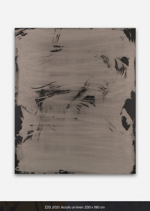
Z85, 2024
Acrylic on linen23
3/5 × 19 7/10 in | 60 × 50 cm

Giant, sweeping waves and splashes of thick paint flood our souls in vibrant colour. Inspired by Abstract Expressionism, the art of Yago Hortal has a direct connection with the viewer, creating sensations that balance between chaos and order. The contemporary artist paints with spontaneous yet also planned action. Brushstrokes that smear, marble, and splatter, recreate the face and personality of colour in our contemporary age.
Yago Hortal was born and raised in the city of Barcelona. He uses industrial colors and materials that reference an urban experience. Within his studio, he listens to different music genres that mould his emotional state before painting. As energy flows onto the canvas, it is captured and preserved as a physical signature.
“What matters to me is that the rhythm of each brushstroke can be reflected in a single gesture…each brushstroke acting as a reflection of the moment it was made. That’s why all my paintings are also a kind of personal diary.” - Yago Hortal
characterized by its intense and vibrant chromaticism.
“ I am known for very gestural artwork, very liquid, with a very marked gesture, very clear, as well as a very thick density and exuberant color.”
Kathy Prendergast
Intimate in tone and subject matter, Kathy Prendergast’s practice combines drawing, sculpture and installation. What might appear minimal or elusive at first glance can encompass a complex web of emotional, personal and political resonances. Proximate to the body and connecting subjective reflections on the world, her work explores a potent cluster of issues including power, identity, landscape, memory, geography, and family. A connection between the body and landscape, often manifested through mapping, can be traced back to the beginning of her practice. Often using redaction or removal as a device, creating negative space through black ink, coloured paint or white paper, the artist erases or overwrites geographic expressions of power. Prendergast points out the subjectivity of maps, their inherent colonialism, and the ultimate fragility of borders and territories over time. Though delicate, fragile and usually on a human scale, her works also point towards the infinite – suggesting the vastness of space or the constellations of the sky. Prendergast’s work is methodical – the product of slow, repetitive processes requiring patience, precision and devotion. Faithful to mark-making, drawing and hand-crafting as well as the revelatory potential of sparking unfamiliar connections with everyday objects, her work is enigmatic, eerily beautiful and emotionally resonant.


Throughout her career Kathy Prendergast has received international critical acclaim for her work with cartography

Kathy Prendergast’s Black Map series, from which these works are selected, are produced using printed motorist maps almost entirely obscured with ink. Tiny white spots that represent towns, villages, and cities pinpoint places of habitation and, up close, the place names, road numbers, and contour lines peer through the surface. From afar the ink appears opaque and the effect is that of a night sky dappled with strange and unfamiliar constellations.
Everyone loves a map, everyone loves a globe


Buckling of paper

Watercolour paper warping occurs when the fibres in the paper absorb moisture unevenly, causing it to expand and contract in different places. The flat surface becomes warped and it dries stuck in this position
Let’s imagine that when you paint on your paper, you’re adding water to the top of it. Those fibres will expand, yet the underneath of the paper will be dry. This causes the top of the paper to lift up as it grows, while the bottom pulls under, creating an arch.
And if you create puddles of really wet patches when you paint, the surface will be wetter and drier in different areas, creating uneven warping.
As the paper dries, the fibres will decrease in size again, but the paper may remain a little warped.
Bonus: How to stretch your watercolour paper
Prep your paper by thoroughly wetting both sides in a layer of clean water. Lay out on a flat surface like a wooden board and pull and stretch the paper tight. Tape down the edges with strong painters tape, or staple it down. Allow to dry completely before painting on it.
Some artists swear by stretching their papers, but I find it difficult and fiddly to lift them off the board. You’d probably have to just cut the edges off next to the tape because it won’t peel, and this is too faffy for my impatient brain. But if stretching works for you, go for it and enjoy warp-free painting!

For over forty years, Bernard Frize has examined what it means to make a painting. Working in series, he has developed diverse protocols in order to undermine his own creative role and thus free his compositions of self-expression. For Frize, paint, resin, brush and canvas are not materials to be mastered, but collaborators with whom he enters into a working relationship. The terms of this partnership may vary from series to series, but ever-constant is the notion that the media itself is equally as important as the hand of the artist in determining the look and feel of a final painting. Subtle in some works and significant in others, the drips, pools, swirls, and blobs of paint found throughout Frize’s large colorful abstractions evidence his anti-auteur relationship to painting. Preferring to raise questions rather than provide answers, Frize invites viewers to consider the implications of process and materials (what is painting) on form and content (what is a painting).

OMENA, 2023
Acrylic and resin on canvas
150 x 130 cm | 59 1/16 x 51 3/16 inch
Unique
Bernard Frize’s paintings are neither narrative nor mutilated, but they owe their creation, in large part, to a kind of sanctioned degeneration. Unruly paint has been allowed to bleed over the artist’s own brushwork, complicating systematic strokes with smudges, swathes and stains whose amorphous hazy forms that suggest various celestial bodies. Managing to appear simultaneously vibrant and on the brink of ruin, the canvas reflects Frize’s complex and ever-evolving relationship to paint, the act of painting and what it means to be a painter.
Andy Goldsworthy
https://doorofperception.com/2016/03/andy-goldsworthy-working-with-time/

Goldsworthy made work with snowballs, ice and natural materials, the melting process on watercolour paper echoing the processes in the natural world.
The drawings in this exhibition are made with snowballs, ice and natural materials from different locations: Borrowdale graphite, Borrowdale slate, Derwent water, Drumlanrig clay, Pit clay, and earth from the source of the Scaur River, Penport. The process of the snowballs melting on watercolour paper and forming the drawings echoes processes in the natural world: erosion, sedimentation, ice and flow. The visual structure and colour qualities thus produced are extraordinary.
The Ice and Snow Drawings have two main sources. The first Arctic Snowballs of 1989 resulted from an experience Goldsworthy had while out hunting with his Inuit guide Luti and his son. Coming across a breathing hole in the ice pack, Luti circled around at a distance, moving towards the hole, while his son stood ready with his gun in anticipation of the rising seal.
Dark blood dripped and trailed in the snow as the sledge moved off, carrying carcass and hunters. The seal was caught by the hunter’s instinct and knowledge of its survival habits.
The second source for the Snowball Drawings was an experience made by Goldsworthy following an exhibition at Glasgow’s Tramway. His large snowballs, which gradually melted during the course of the show, left an afterimage caused by the ‘impurities’ in the snowball.
On another occasion in the Arctic, Goldsworthy and his guides came across a polar bear’s tracks in the snow. Running parallel to this were the tracks of a mechanised skidou. Luti’s comment was simply: “dead bear.”
This experience of immersion in the natural world continues with the snowball drawings, but other questions arise. In the drawing with graphite from Borrowdale – one of the main sources for this material – there is a dual process: on the one hand natural, on the other with the artist’s participation. Who, or what, is making the drawing?
The oeuvre of artist Andy Goldsworthy utilises ‘found’ natural objects like leaves, rocks, ice and sticks to create captivating, often ephemeral interventions into the natural landscape that remind us of the power of natural beauty and the continuously changing seasons. Architectural writer Eva Menuhin discusses some of the traits in his work, which has recently become more monolithic yet is still concerned with movement, natural materiality and time, as seen in his work in progress ‘Hanging Stones’.
