Ammonite Life Assemblage At Lyme Regis


ammonite life assemblage at Lyme Regis
More Posts from Starry-shores and Others
Megalith Cist Burials Found in Southern India

Archaeologists have uncovered a total of 250 cairn circles in southern India’s trade and industrial center of Kodumanal, which was inhabited from the 400s through first century B.C.E.
The cairn circles were made of giant rocks, or megaliths. Most of the cairn circles were around rectangular chambers built of megaliths, which in turn contained burial cists and three or four bowls or pots. The pottery was likely for offerings placed outside the burial cists, showing a belief system that included something after death.
An impressive ten pots and bowls were recently unearthed in a larger circle made of boulders and rectangular-shaped cists made of stone slabs, surrounding a three-chambered burial. This larger, more complex burial might have been intended for someone important in the community.
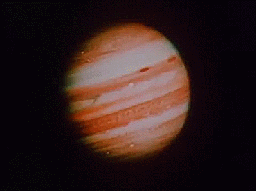
Jupiter seen by NASA’s Voyager spacecraft
Animation taken from video: Jeff Quitney

Orion Nebula in Oxygen, Hydrogen, and Sulfur via NASA https://ift.tt/2GB0bRc

Can you believe this monster snake actually existed?
Titanoboa is an extinct genus of very large snakes that lived in what is now La Guajira in northeastern Colombia. They could grow up to 12.8 m long and reach a weight of 1,135 kg. Fossils of Titanoboa have been found in the Cerrejón Formation, and date to around 58 to 60 million years ago.
Titanoboa skeleton on display at Queensland Art Gallery
sauropod emojis, as rated by a palaeontology student
apple:

not a bad start here overall! this is recognisably intended as a brachiosaurid, and the skull shape and overall profile are pretty good (though they look a bit juvenile-ish). points off, though, for the inaccurate hands - rather than elephantine columns, they were more shaped like lima beans in cross-section. yes, really. they also only had one claw per hand (it was on the thumb). also points off for having the external fleshy nostril located on the dome of the skull; while this is the position of the bony external nostril, there is evidence that the fleshy nostril was probably located at the tip of the snout. its dead eye haunts me
score: 7/10 solid attempt
google:

google clearly went for a cartoonier approach, and to my view it served them well. still recognisably a brachiosaur - the shape of the skull and overall proportions make it resemble Europasaurus, a type of dwarf sauropod that lived on an island in what is now eastern europe. which immediately ups its score in my book. however, it falls victim to the same issues with elephantine hands as did the apple one, and as such i can’t give it a perfect score.
score: 9/10 friendly!
microsoft:

this emoji cleverly avoids any scientific inaccuracies by being extremely cartoony. i like the use of single colours rather than gradients. a little too simple for my tastes though. i can’t tell what find of sauropod, if any, it was intended to be - a brachiosaur, because of the upright neck? a mamenchisaur, maybe? i have little to work with.
score: 6/10 just too vague
samsung:

i don’t like her at all. clearly a brachiosaur - sensing a common theme - but something about it is just unpleasant to me. the body seems too fat, the limbs too short, the tail too noodly, the head too pointy. also messes up the hands again.
score: 3/10. please leave.
whatsapp:

at last, an emoji that bucks the brachiosaur trend!! this is clearly not a brachiosaur. in fact, it looks like a possible Cetiosaurus-type deal. whatever it is, it’s charming. the nostrils are at the end of the snout as they should be and - is it? - can it be? - it is! the hands are anatomically correct! each clearly has one claw, located on the thumb, and though we can’t see well, they don’t appear to be elephantine. i love them a lot.
score: 10/10 only shooting stars break the mold - oh god im so sorry i shouldve phrased that differently–
twitter:

a classic. what it lacks in detail it makes up in simplicity. it has pleasant lines and an appealing silhouette. it’s extremely vague and not based off of any real genus, and the tail is far too short, but for some reason this doesn’t bother me too much.
score: 8/10. exquisite
facebook:

hm. hmm. a lot of anatomical though was clearly put into this; overall the body form looks like a plausible sauropod. the proportions look a little weird, sure, but that seems to be perspective - after all, most sauropods were gigantic beings. beefy boys, if you will. its nostrils, upon close inspection, are correctly placed; however, its hands and feet are all messed up. i guess the real conundrum for me is that it seems to be a mish-mash of sauropods - remove the braciosaur-like domed skull, and it would be a great fit for an Apatosaurus.
score: 8/10 i’m conflicted
joypixels

what in the hell is joypixels? and what in the hell is this? i just…the hands and feet are plantigrade, meaning that the ankles touch the ground, when actual sauropods were digitigrade - walking on their toes. the shoulder and hip muscles aren’t there, and instead the limbs are just awkwardly connected to the body. it reminds me of a turtle, and not in a good way.
score: 4/10. uninspired and dull
openmoji:

they didnt try. nor will i.
score: 0/10 make an effort
emojidex

every emojidex emoji i have ever seen has just been awful. this is no different. this looks like a stereotypical loser from a meme, but as a dinosaur. the contrast between the decently moderate level of artistic detail put in and the blatant disinterest towards making it look like an animal is staggering. just awful.
score: -3/10 i just cant care enough about it to rate it lower
emojipedia:

excuse me? what the fuck? what the fuck is this? this is the main character from the low-budget ripoff of the good dinosaur. the head looks like a Corythosaurus and the body looks like barney in leapfrog stance. the gradients just make me feel a little sick. it’s awful. look at the hindlimbs and tell me that any love was put into drawing this. it’s like how a dinosaur would be drawn on tom and jerry but like, the bad charmless ones made in the 90s that were trying hard to emulate the originals. the hands look like green snowboots.
score: -500/10 i hate you i hate you i hate you i hate you i hate you i hate you
A ten billion-year stellar dance by europeanspaceagency
Voyager: The Golden Record
It’s the 1970s, and we’re about to send two spacecraft (Voyager 1 & 2) into space. These two spacecraft will eventually leave our solar system and become the most distant man-made objects…ever. How can we leave our mark on them in the case that other spacefarers find them in the distant future?
The Golden Record.

We placed an ambitious message aboard Voyager 1 and 2, a kind of time capsule, intended to communicate a story of our world to extraterrestrials. The Voyager message is carried by a phonograph record, a 12-inch gold-plated copper disk containing sounds and images selected to portray the diversity of life and culture on Earth.
The Golden Record Cover
The outward facing cover of the golden record carries instructions in case it is ever found. Detailing to its discoverers how to decipher its meaning.
In the upper left-hand corner is an easily recognized drawing of the phonograph record and the stylus carried with it. The stylus is in the correct position to play the record from the beginning. Written around it in binary arithmetic is the correct time of one rotation of the record. The drawing indicates that the record should be played from the outside in.

The information in the upper right-hand portion of the cover is designed to show how the pictures contained on the record are to be constructed from the recorded signals. The top drawing shows the typical signal that occurs at the start of the picture. The picture is made from this signal, which traces the picture as a series of vertical lines, similar to ordinary television. Immediately below shows how these lines are to be drawn vertically, with staggered “interlace” to give the correct picture rendition. Below that is a drawing of an entire picture raster, showing that there are 52 vertical lines in a complete picture.

Immediately below this is a replica of the first picture on the record to permit the recipients to verify that they are decoding the signals correctly. A circle was used in this picture to ensure that the recipients use the correct ratio of horizontal to vertical height in picture reconstruction.

The drawing in the lower left-hand corner of the cover is the pulsar map previously sent as part of the plaques on Pioneers 10 and 11. It shows the location of the solar system with respect to 14 pulsars, whose precise periods are given.

The drawing containing two circles in the lower right-hand corner is a drawing of the hydrogen atom in its two lowest states, with a connecting line and digit 1 to indicate that the time interval associated with the transition from one state to the other is to be used as the fundamental time scale, both for the time given on the cover and in the decoded pictures.
The Contents
The contents of the record were selected for NASA by a committee chaired by Carl Sagan of Cornell University and his associates.

They assembled 115 images and a variety of natural sounds, such as those made by surf, wind and thunder, birds, whales and other animals. To this, they added musical selections from different cultures and eras, and spoken greetings from Earth-people in fifty-five languages, and printed messages from President Carter and U.N. Secretary General Waldheim.

Listen to some of the sounds of the Golden Record on our Soundcloud page:
Golden Record: Greetings to the Universe
Golden Record: Sounds of Earth

Songs from Chuck Berry’s “Johnny B. Goode,” to Beethoven’s Fifth Symphony are included on the golden record. For a complete list of songs, visit: https://voyager.jpl.nasa.gov/golden-record/whats-on-the-record/music/

The 115 images included on the record, encoded in analog form, range from mathematical definitions to humans from around the globe. See the images here: https://voyager.jpl.nasa.gov/golden-record/whats-on-the-record/images/
Making the Golden Record
Many people were instrumental in the design, development and manufacturing of the golden record.

Blank records were provided by the Pyral S.A. of Creteil, France. CBS Records contracted the JVC Cutting Center in Boulder, CO to cut the lacquer masters which were then sent to the James G. Lee Record Processing center in Gardena, CA to cut and gold plate eight Voyager records.

The record is constructed of gold-plated copper and is 12 inches in diameter. The record’s cover is aluminum and electroplated upon it is an ultra-pure sample of the isotope uranium-238. Uranium-238 has a half-life of 4.468 billion years.
Learn more about the golden record HERE.
Make sure to follow us on Tumblr for your regular dose of space: http://nasa.tumblr.com

Comet meets cluster by europeanspaceagency
“Nightfall”, by Asimov and Silverberg
I haven’t picked a book apart in a while, so have some mildly-disjointed thoughts on Asimov & Silverberg’s 1989 novel, mostly focused on the somewhat-ropey astronomy, but looking at a few other things as well…
Keep reading

-
 green-froggie liked this · 4 years ago
 -
 ok321letsgo reblogged this · 4 years ago
 -
 palkias-space reblogged this · 4 years ago
 -
 aspity reblogged this · 4 years ago
 -
 ks44im75 liked this · 4 years ago
 -
 dasinew liked this · 4 years ago
 -
 omcgowan liked this · 4 years ago
 -
 camelittle liked this · 4 years ago
 -
 nasanerd09 reblogged this · 4 years ago
 -
 queenoftheothernight liked this · 4 years ago
 -
 bibliophiliosaurus reblogged this · 4 years ago
 -
 interstate-5 liked this · 5 years ago
 -
 thatonegeekyouknow liked this · 5 years ago
 -
 carminalife liked this · 5 years ago
 -
 nopride-noshame reblogged this · 5 years ago
 -
 queen-does-a-thing liked this · 5 years ago
 -
 daddydogman liked this · 5 years ago
 -
 rainydaysrbest liked this · 5 years ago
 -
 fireflia reblogged this · 5 years ago
 -
 joelpersels liked this · 5 years ago
 -
 wayti-blog reblogged this · 5 years ago
 -
 stressandscience reblogged this · 5 years ago
 -
onceuponadumbass liked this · 5 years ago
-
 dragobsessedandposessed liked this · 5 years ago
 -
 a-strange-grey liked this · 5 years ago
 -
 ladythmpr liked this · 5 years ago
 -
 paisaaa66 liked this · 5 years ago
 -
 cuchullame liked this · 5 years ago
 -
 peoplemcnugget1 liked this · 5 years ago
 -
 magpie-superstition reblogged this · 5 years ago
 -
 hydrias liked this · 5 years ago
 -
 volcano-shark liked this · 5 years ago
 -
 sorinkavglazy liked this · 5 years ago
 -
 greyreveries reblogged this · 5 years ago
 -
 supermarioallstars reblogged this · 5 years ago
 -
supermarioallstars liked this · 5 years ago
-
 ripleycall liked this · 5 years ago
 -
 noelle-mignonette-blog reblogged this · 5 years ago
 -
noelle-mignonette-blog liked this · 5 years ago
-
 hummingwyrd reblogged this · 5 years ago
 -
 mevssea reblogged this · 5 years ago
 -
 predoviciu reblogged this · 5 years ago
 -
predoviciu liked this · 5 years ago
-
 venti-tensor-fasciae-latae liked this · 5 years ago
 -
 4sensesplusascarf liked this · 5 years ago
 -
ok321letsgo liked this · 5 years ago

Amateur astronomer, owns a telescope. This is a side blog to satiate my science-y cravings! I haven't yet mustered the courage to put up my personal astro-stuff here. Main blog : @an-abyss-called-life
212 posts